AI for Analyst Reports and Dashboards: SQL, Metrics, and the Weekly Pack
Written by Ahmed at Analyst Engineering, a Senior Technical Business Analyst with 10+ years in banking and payments delivery.
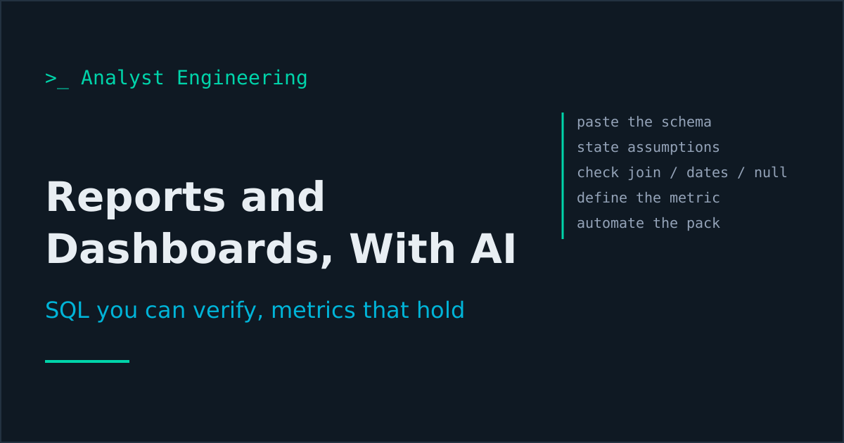
Key takeaways
- Give the model the schema, not the table names. Paste the real DDL or the information_schema output, because a query written against remembered column names runs, returns numbers, and is wrong in a way nothing will flag.
- Never run generated SQL against production without reading it. Check the join type, the date boundary, the null handling, and the grain, then run it with a LIMIT first. Those four are where generated queries are wrong far more often than in the logic you were focused on.
- The hardest part of a dashboard is not the chart, it is the metric definition. Use AI to write the definition down (numerator, denominator, filters, grain, timezone, exclusions) and to find where two existing reports define the same word differently.
- Automate the weekly delivery pack, not the judgment in it. The numbers, the ticket movements, the defect counts, and the changed scope can all be assembled on a schedule; what happened and what you are going to do about it is the part people read.
- Cross-check every number two ways before it goes in front of a stakeholder. A generated query that is subtly wrong produces a confident, plausible number, and you will be asked to defend it in a room where nobody can check it.
Paste the schema, not the table names. Read every generated query for join type, date boundaries, null handling, and grain before running it, then run it with a LIMIT. Use AI to write metric definitions down properly and to find where two reports define the same word differently. Automate the assembly of the weekly pack and write the narrative yourself.
Every analyst has a reporting layer they never built. The defect trend somebody asks for monthly and you rebuild by hand each time. The dashboard the programme manager wanted in March. The weekly pack that takes ninety minutes on Thursday afternoon, every Thursday, forever.
This is part eleven of The AI Analyst, and it is the part with the most immediately visible payoff, because reporting is visible by definition. It is also the part with the sharpest failure mode: a wrong number delivered confidently to people who cannot check it.
Why does generated SQL need more review than generated prose?
Because being wrong looks identical to being right.
A generated paragraph with a fabricated status code looks slightly off to a practised reader. A generated query with an inclusive date boundary where you needed exclusive returns a number. The number has the right magnitude, the right shape, and no indication of the defect. You put it in a slide. Somebody makes a decision.
So the discipline here is not about prompting. It is about a review routine you run every time, and about pasting the schema.
Step 1: paste the schema, always
The single highest-value habit in this article.
SELECT table_name, column_name, data_type, is_nullable
FROM information_schema.columns
WHERE table_schema = 'payments'
ORDER BY table_name, ordinal_position;
Paste that output. Not “we have a payments table and a refunds table,” because a model given table names will invent column names that are entirely reasonable, the query will run if the names happen to be close, and the result will be wrong. Given the real DDL it uses the real names, and if it needs something that does not exist it tells you.
Add three more things:
- The enumerated values.
statusbeingVARCHAR(20)tells the model nothing.status IN ('PENDING','SETTLED','RETURNED','REJECTED')tells it everything. - The grain of each table. One row per payment, or one row per payment status change. This is the difference between a correct count and a count multiplied by four.
- The known traps. “The
paymenttable contains test records whereclient_id = 0.” Every warehouse has three of these and none of them are documented. Write them down once, keep them in your context pack, and paste them every time.
Step 2: ask precisely, and demand assumptions
Schema attached above.

Write a query that returns, for each day in September 2026, the
count of payments that were rejected, split by rejection reason code.

- Grain: one row per day per reason code.
- Use the payment_event table, not payment, because a payment can be
  rejected and resubmitted.
- Timezone: report in Europe/Paris, the timestamps are UTC.
- Date boundaries: include 1 September 00:00 and exclude 1 October
  00:00, local time.
- Exclude test records (client_id = 0).

Before the query, state every assumption you made.
After the query, state what could make this number wrong.
The two bookends are worth more than the query. The assumptions list surfaces the decision the model made about your data that you did not specify, which is usually about duplicates or about which timestamp column represents the event. The “what could make this wrong” section is the model’s own warning list, and it is often correct: a payment rejected twice counts twice, a reason code that changed meaning in July, rows with a null reason.
Step 3: the four-point review
Before any generated query runs against production, check four things. It takes a minute and it catches almost everything.
Join type and cardinality. Does any join hit a table with more than one matching row? If so, every aggregate is inflated and nothing will tell you. This is the most common defect by a distance. Check it by running the join with COUNT(*) and comparing to the row count of the base table.
Date boundaries. BETWEEN '2026-09-01' AND '2026-09-30' silently drops everything after midnight on the 30th when the column is a timestamp. Month-end reporting lives and dies here. Prefer >= start AND < next_start always, and check that the model used it.
NULL handling. WHERE status != 'SETTLED' excludes rows where status is null, which is usually not what you meant. COUNT(column) skips nulls; COUNT(*) does not. Both are silent.
Grain. Does the result have one row per thing you think it has one row per? Run it with LIMIT 20 and look at the actual rows. Not the count, the rows.
Then run it with a limit, then run it fully, then cross-check one number against a source you already trust: an existing report, the application’s own screen, a count from the ticket system. If the two agree you are probably fine. If they do not, you have found either a bug in the query or a genuine discrepancy between systems, and the second one is a finding worth more than the report.
If SQL is not yet solid for you, SQL for analysts is the ground floor and SQL window functions for analysts is what you need for the latest-record and event-timing patterns that dominate delivery reporting. You cannot review a query you cannot read, and reviewing is the job here.
Step 4: the metric definition, which is the actual hard part
Charts are easy. Agreement about what a number means is hard, and it is where reporting projects die.
Two teams report “failed payments.” One counts payments that were rejected at validation. The other counts payments that did not reach settlement by cut-off, which includes rejections plus timeouts plus everything stuck in a queue. Both are correct. Neither definition is written down. The monthly meeting is an argument about whose number is right, every month, for a year.
Use AI to end that, by writing definitions down properly:
For the metric "payment failure rate", produce a full definition:

- numerator: exactly which events, with the status values and the
  table
- denominator: exactly which population
- grain and time window
- timezone
- exclusions (test data, internal transfers, reversals)
- edge cases that change the number: retries, partial settlements,
  payments that fail and succeed on resubmission
- the SQL that implements it

Then list every way a reasonable person could define this
differently, and what each alternative would include or exclude.
That last paragraph is the useful one. It gives you the menu of definitions to take to the meeting where you agree on one, rather than discovering the disagreement after the dashboard is built.
Then the archaeology, which is the highest-value single prompt in this article:
Here are the queries behind our four existing payment reports:
[paste]

Find every place where these reports define the same concept
differently. Quote the differing logic and state what the numerical
difference would be.
I have run this on a programme and found three definitions of “settled” across four reports, one of which excluded a whole channel because of a filter somebody added in 2023 for a reason nobody remembered. That is a governance finding, it explains a year of confusing meetings, and it took one prompt plus an afternoon of verification. Data lineage is the structural fix once you know.
The broader technical foundation for this kind of work, reading code, querying data, and talking to engineers as an equal, is in The Technical Skills Guide for BAs.
Step 5: the dashboard nobody had time to build
The reason the dashboard does not exist is rarely the tool. It is that building it means writing eleven queries, and every one takes forty minutes of schema archaeology. That cost is what collapses here.
The order that works:
- Decide the questions first, in writing. Five at most. “Are we going to hit the date,” “what is failing and is it getting worse,” “where is the queue building,” “what changed this week,” “what needs a decision.” A dashboard is a claim about what matters; picking wrong produces something people glance at once.
- Define each metric using the previous step. Write the definitions on the dashboard itself, or one click away. A number with no definition generates a meeting.
- Generate the queries, review them four ways, cross-check each number.
- Generate the configuration. Most tools take SQL plus a chart specification, and several take code or a JSON definition an assistant can write directly. For a simple internal dashboard, a static page rendering a few charts from a scheduled query export is often faster to build and easier to audit than a licensed tool.
- Add a freshness timestamp. “Data as of 2026-09-16 07:00.” Without it, every stale dashboard eventually misleads someone, and the ones that mislead quietly are the dangerous ones.
Keep it to five numbers. A dashboard with thirty tiles is a data dump that shifts the work of noticing onto the reader, and readers do not do it. Looker vs Tableau covers the governed-metric versus visual-exploration trade-off if you are choosing a tool rather than inheriting one.
Step 6: the weekly delivery pack
Ninety minutes every Thursday, most of it copying numbers. Split it in two.
Automate the assembly. A script, not a prompt, because the transformation is fixed and you want the same answer every time:
- Ticket movements this week from Jira, by status, with what moved to Done.
- Defects raised, closed, and open by severity, with the trend.
- Test execution progress against the plan from part nine.
- Scope changes: anything added to or removed from the fix version.
- Environment availability and blockers.
- Anything overdue.
Automating Jira and Confluence with the REST API and a PAT has the code for the Jira half. Schedule it for Thursday morning, output a Markdown file.
Write the narrative yourself. Two paragraphs: what actually happened, and what you need from the reader. This is the part people read, and it depends on things that are in no system: that the vendor call went badly, that the operations lead is about to escalate, that the number looks fine because the environment was down for two days.
A pack that is entirely generated gets skimmed and ignored, because readers can tell. A pack where the numbers are automatic and the two paragraphs are unmistakably yours gets acted on. That split is the whole design.
You can use AI for a first draft of the narrative by giving it the assembled numbers plus your rough notes, the same flow as part one. Just make sure the judgment in it is yours, because you will be asked to defend it.
What goes wrong
A number you cannot defend. The one that ends careers quietly. You present a figure, a director asks how it is calculated, and you cannot answer because you did not read the query. Read the query. Every time. Keep it next to the number.
The dashboard nobody reads. Thirty tiles, no questions, no definitions. Built because it was suddenly cheap to build. Five numbers that answer five questions beat it entirely.
Definition drift. The dashboard was right in June, the status taxonomy changed in July, the query still runs and now means something else. Review definitions at every release, the same discipline as refreshing the context pack.
Automating the judgment. A fully generated status report reads as competent and says nothing. The assembly is mechanical. The interpretation is why you are in the meeting.
The takeaway
For reports and dashboards, paste the schema rather than the table names, demand the assumptions before the query and the failure modes after it, and review every generated query for join cardinality, date boundaries, null handling, and grain before it touches production. Cross-check every number two ways.
Use AI hardest on metric definitions, which is where reporting actually fails, and on finding where your existing reports already disagree. Build a five-number dashboard that answers five written questions, timestamped. Automate the assembly of the weekly pack and write the narrative yourself, because the narrative is the part anyone reads.
Next: part twelve, the capstone, where all eleven parts become one working week and a position you can describe in an interview. The full path is on The AI Analyst.
Ahmed is a Senior Technical Business Analyst with 10+ years in banking and payments. He builds practical guides and tools for analysts at The Tech BA Toolkit.
Tags: Business Analysis, Artificial Intelligence, SQL, Reporting, Data
About the author
Analyst Engineering is written by Ahmed, a Senior Technical Business Analyst with 10+ years of banking and payments delivery experience: ISO 20022 and SWIFT messaging, payments API integration, Kafka event validation, and production support. Every article comes from real delivery work, and each one is reviewed and updated as tools and standards change.
Related articles
- AI-Built API Collections and Scripts: Postman, Bruno, and the Checks You Repeat Turn an OpenAPI contract into a Bruno or Postman collection with real assertions, generate the chaining scripts, and put the whole suite behind a CI gate.
- SQL for Analysts: Query the State, Find the Truth The SQL a technical analyst actually needs: SELECT, WHERE, JOIN, GROUP BY, and reading state during analysis and testing. Not for reports, for finding the truth.
- SQL Window Functions for Analysts: Latest Record, Event Timing, Running Totals What SQL window functions do and the three patterns analysts use daily: ROW_NUMBER for latest record per group, LAG for event timing, SUM OVER for running totals.
- The AI Analyst Operating System: Eleven Parts, One Working Week How the whole AI analyst stack fits into a real week, the 90-day build order, what to measure, how to lead adoption on your team, and what to put on your CV.
Free account
Practice on the Labs, keep your progress
A free account, no password: an email link signs you in. It saves your steps and self-assessments on the Labs, shows your missions on a dashboard, unlocks the solutions, and, if you tick the box, sends you new missions and articles when they ship.
Your email is used to sign you in. Nothing else, unless you ask. Privacy.